Malan's summer studio 2020: IoT Product Development from a Data Perspective.


This blog is created to share my learning experience and showcase my portfolio over this 6 week summer studio. I will upload a post by the end of each week. Enjoy my blog!
|
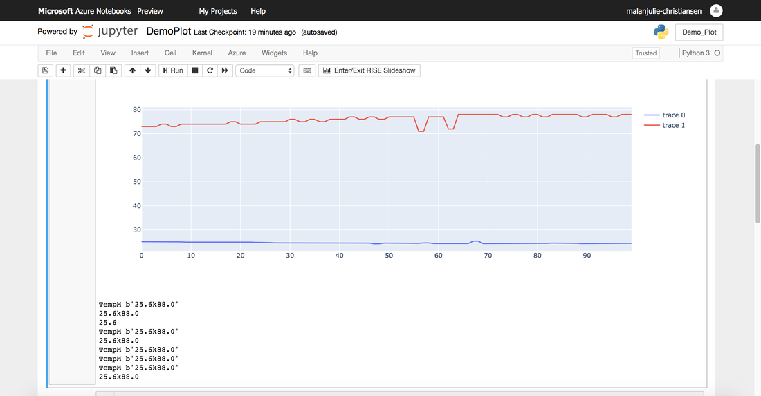
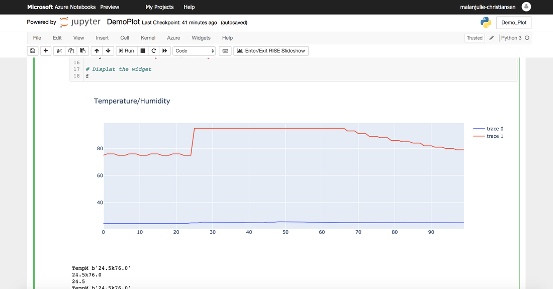
In this week's sprint I have focused my efforts on the programming language Python, and how to plot my data using Plotly in Jupyter Notebook, as you can see in below photo. To run Jupyter Notebook, I used Microsoft Azure and to get started I installed paha-mqtt for connecting to my database and plotly to visualise my data in Jupyter Notebook: #!conda install "notebook>=5.3" "ipywidgets>=7.2" -y #!conda install plotly -y #!pip install paho-mqtt After this I ran these lines of code using these two guideline from plotly's website: Line charts in in Plotly and Plotly Figure Widget overview in Python. 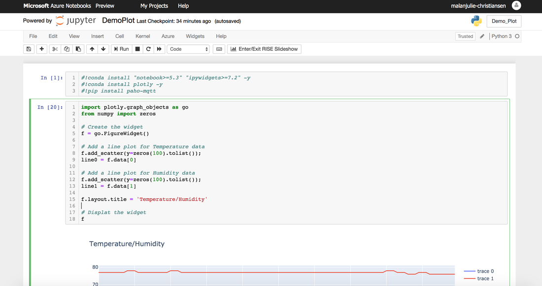 This line of code got the widget showing, but in order to connect the data from our mqtt broker, I had to subscribe to my database TempM, which I created in week 2. Furthemore, to get the graphs showing humidity and temperature, I had to split them as well, as I have also done in Visual Studio Code. As you can see in my code, line 0 is temperature and line 1 humidity. 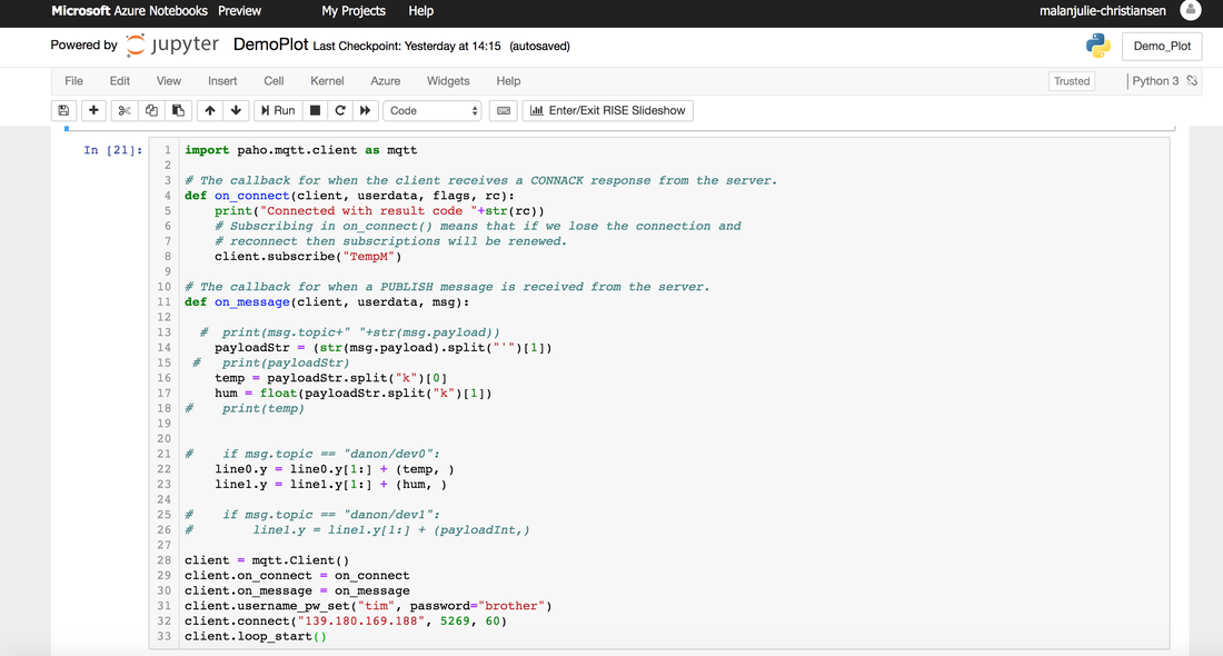 The result was these photo below. The second screenshot is when I blew on the sensor, and the graphs started fluctuating.
Additionally this week, I completed this 6.5 hours online course including lots of exercises to get more practical experience. 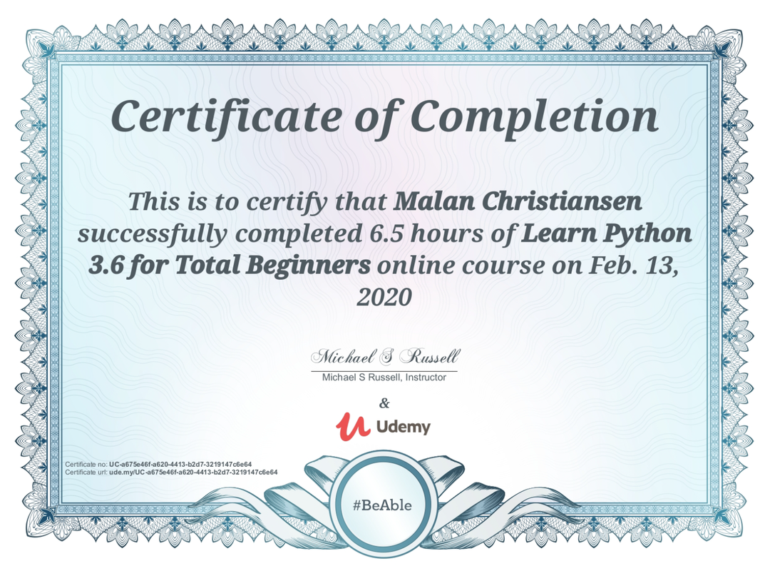
0 Comments
Leave a Reply. |
Malan ChristiansenMy weekly experience of UTS summer studio 2020: IoT Product Development from a Data Perspective. ArchivesCategories |
 RSS Feed
